


-
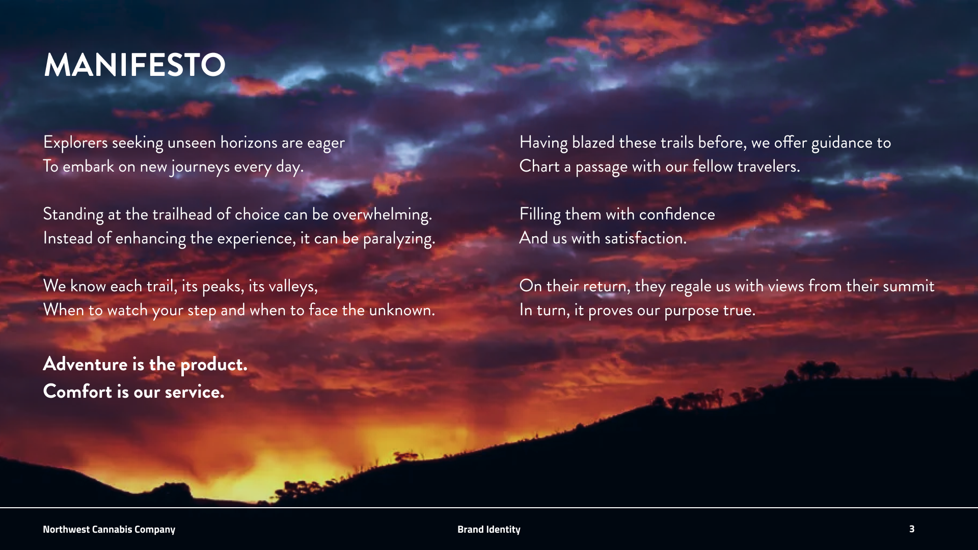
Explorers seeking unseen horizons are eager
To embark on new journeys every day.
Standing at the trailhead of choice can be overwhelming.
Instead of enhancing the experience, it can be paralyzing.
We know each trail, its peaks, its valleys,
When to watch your step and when to face the unknown.
Adventure is the product. Comfort is our service.
Having blazed these trails before, we offer guidance to
Chart apassage with our fellow travelers.
Filling them with confidence And us with satisfaction.
On their return, they regale us with views from their summit
In turn, it proves our purpose true.
BRAND GUIDELINES
2024 CASCADIA CREATIVE AWARD WINNER
BEST IN STUDENT: Student Work (Portland State University) with “Company Rebrand” campaign for Northwest Cannabis Company


-
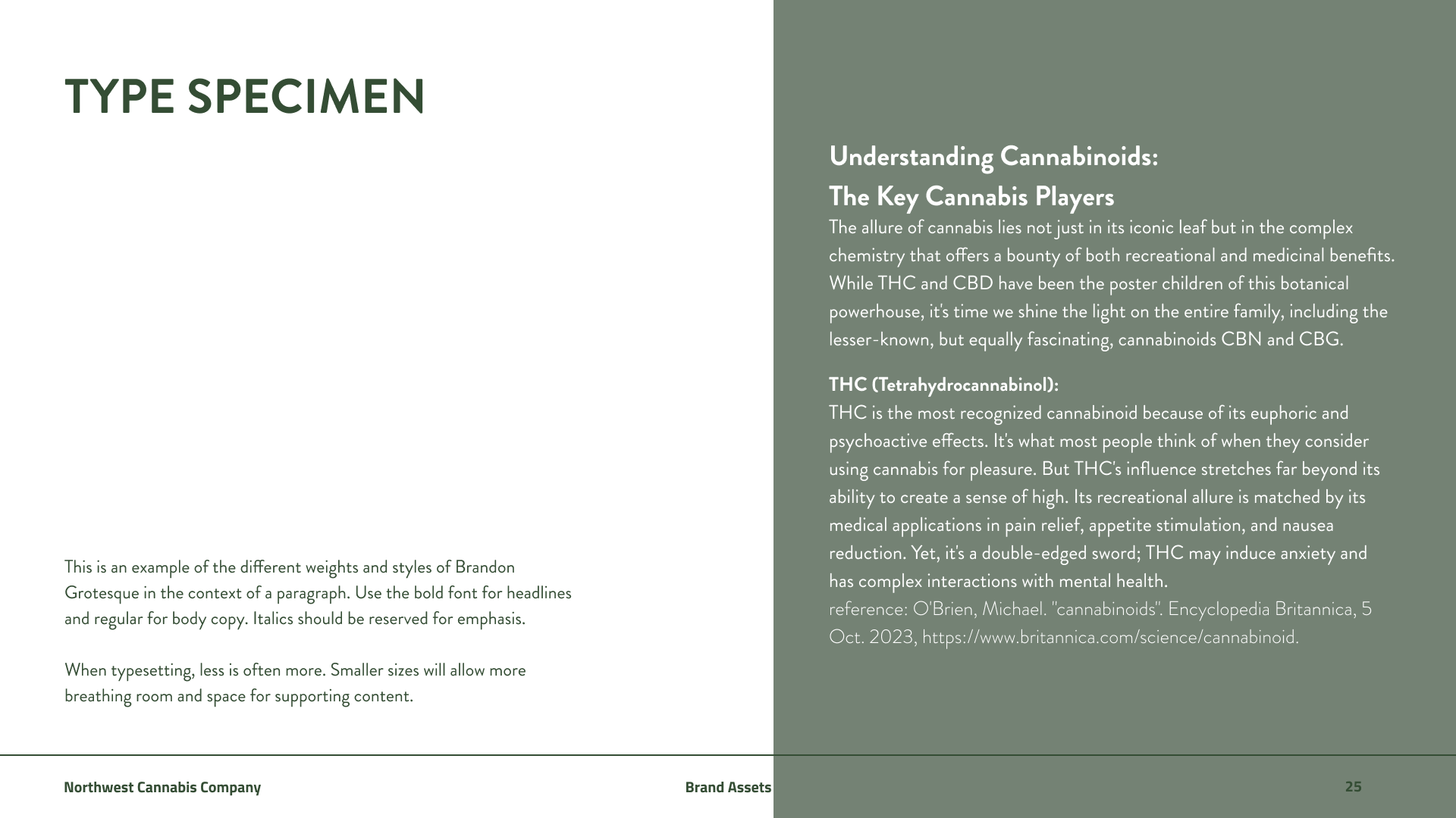
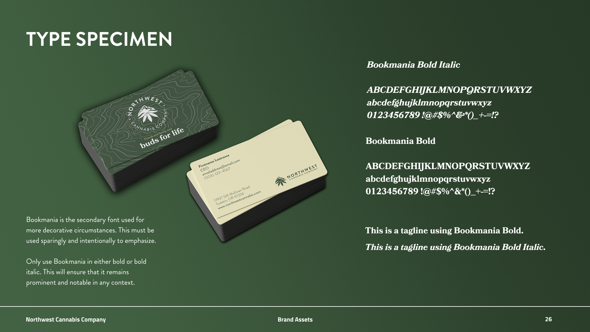
Type specimens show the full extent of a typeface family of fonts. This is a reference to see what the font should look like when implemented.
Brandon Grotesque is the font of choice for its professionalism and versatility. The bold typeface is a great option for headers and titles, while regular is perfect for body copy.
Keeping type consistent is a crucial way to distinguish our brand and maintain our visual identity.
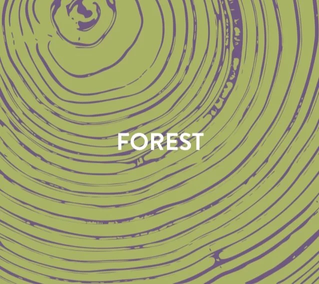
BRANDED TEXTURES
The fir tree is an irrefutable icon of the PNW, and we honor it by using its ring texture to complement our brand graphically.
Rivers connect and nourish us. We channel their flow with this texture to fill space and complement our visuals.

The topography of Mt. Hood grounds us and reminds us of our small presence in the world. The texture of this iconic landmark pairs well with our visuals.


-
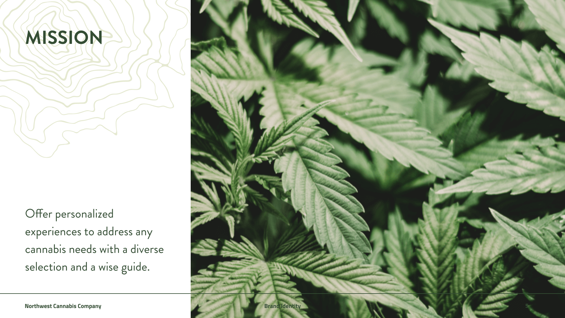
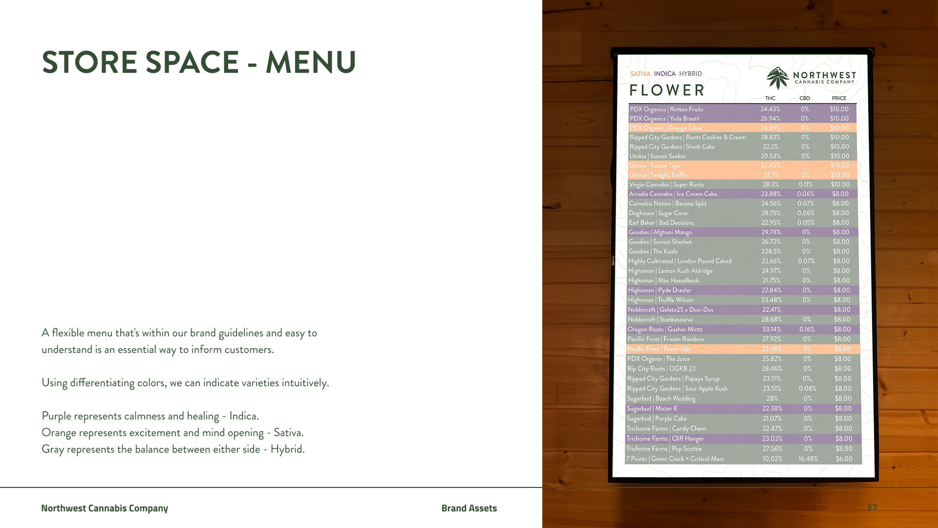
A flexible menu that's within our brand guidelines and easy to understand is an essential way to inform customers.
Using differentiating colors, we can indicate varieties intuitively.
Purple represents calmness and healing - Indica.
Orange represents excitement and mind opening - Sativa.
Gray represents the balance between either side - Hybrid.

-
Sharp packaging lets patrons bring home a piece of North West Cannabis Company they can be proud of.
This is an example of a gift box that can be used to add a personal touch. The clear packaging is a way to offer specialty products the presentation they deserve.

-
Pre-roll flights would allow novices to try a variety of strains hand selected by our experts to offer a point of entry into a journey with many paths.